Picture this: you are the owner of an emerging business in your locale. Let’s say you’ve just opened a new bakery in your neighborhood, you’re the proprietor of a local salon, or you own a pet shop in your block.
Typically, these kinds of small businesses get advertising by word-of-mouth or traditional paper-based advertising like leaflets or posters. These days, however, even small and medium enterprises like the ones mentioned are getting connected to the web. Everyone knows it’s a surefire way to get recognized and attract more clients.
Of course, going online isn’t as simple as just slapping up a business website, getting it operational, and hoping for the best.
It takes a lot of effort to make sure that the website is not only well-made, but also well-maintained. This means that it’s regularly updated and fully functional to provide excellent user experience. Many business websites have failed simply because the owners never took the effort to keep them up-to-date. It would be quite the problem if your own business website doesn’t get its regular website maintenance because it wouldn’t be able to benefit from a host of benefits.
In Tune with the Aesthetics
For the average online user, how a website looks can spell the difference between an extended stay and a quick close of the browser tab or window.
These days, how a page appears is just as vital to a business portal’s chances of attracting more visitors as any other aspect of the page. Unless your intention is to give your users a touch of nostalgia with how your homepage looks, it would do you no good to keep your site’s appearance like something straight out of 1995.
Updating your website regularly allows you to stay in-tune with the latest trends in website UI and aesthetic factors.
You can gauge what items most website visitors look for when logging on and the features that turn off potential repeat visitors. You can also determine new visual factors you can use to make your page livelier and more interactive.
First impressions count. So make sure that you always keep your site looking at its best.
Always Something New to Talk About
It has been said before, but it definitely needs repeating: quality content delivers results and visitors to your business’s website.
Content is a vital part of any marketing strategy; if you have something new to say to the right people, they will hear you out. Sure, it can be difficult to use quality content for marketing, but with patience and the right formula, you are sure to gain positive results in the long run.
Of course, the ‘right formula’ doesn’t just involve posting new pictures of your latest offerings or the previous events that your business has held.
If you are going to keep your website current with your existing and future customers, it has to have fresh and up-to-date content. You don’t just post a picture of your newest cupcakes and pastries; it needs to have a witty caption or a heartwarming message that fits with the season.
Regularly-updated on-page content will help your website stay visible and attract more visitors.
By the Numbers
So, you’ve set up your page with the latest UI features and you even have an interactive video background to go along with it. You’ve also managed to convince yourself to write about the kind of stuff you work on, or you at least found a great writer who will transform all your thoughts into writing for you. You’ve even come up with a schedule for when you put in new images, videos and posts relating to your business.
Now you can start posting and all the consumers will surely come flocking to your page and your physical business location, right? – Wrong!
Sure, you’ve managed to create a rocking business page. You even try to stick to a regular schedule when updating it. But that doesn’t automatically convert to anything right away.
All the effort you’ve put into getting your website in order will go to waste if you don’t understand how to run the numbers related to it. And by numbers, I’m pertaining to page views, unique visitors and average time on-site.
Regularly keeping tabs of these figures allows you to gauge the performance of your page and how it compares to similar pages in your immediate location; it can even give you a snapshot of which pages may need improvement.
While rudimentary knowledge of how analytics work is enough to get you started, it is often best to hand the regular analytics overview to the experts who can break down the specifics for you. This can help you make more informed decisions about your business website.
Immediate Troubleshooting
Oh no! The contact form you placed in your page so that users can order your pastries online doesn’t work!
The pages advertising your new collar offerings in your pet store are missing some pictures!
Some of your pages on your salon website can’t be accessed or are redirected to a different page altogether!
And the worst part of it all? It’s been a problem for your site for a few weeks now. Because of this your site visits and sales conversions have slumped as well! Oh, if only you had checked in regularly with your page, things wouldn’t have been this drastic.
This is probably one of the key benefits of being able to regularly check in on the well-being of your business page. When you peek into your page’s backend and you find something out of touch or non-responsive, you can immediately get a hand of things and do some damage control before it all goes out of hand.
Prompt troubleshooting and problem plugging is vital to ensure that your business site retains its constant visitor traffic. A site that suffers from crashes, bouncing e-mails or failing features and add-ons can suffer a serious reduction in visits. This can also drastically reduce the amount of potential clients.
Always be on the lookout for any signs of a crash or a non-working feature. This can help you avoid complaints and warnings.
Keeping tabs of your business website can be time-consuming if you plan to do all the updating on your own. However, all the effort will be worth it once you get to raise your sales; that’s when you know you’ve been doing your update work right. Just remember, proactive maintenance is the key to keeping you visible in your chosen market! Learn more on how to rope more clients with your digital marketing strategies in the Philippines by contacting us!
The real estate business is a people-to-people industry; clients’ needs are always the top priority.
Clients expect the highest and most comprehensive level of service from agents. The slightest miss can spell out trouble for the company’s reputation in the industry.
This high-end service isn’t limited to physical transactions alone. In today’s internet-connected world, more people scout online to look for real estate agencies to work with.
The way a real estate website works has become a primary metric if it’s worth working with or not.
User Interface Lessons from the Most Popular Real Estate Websites
Real estate businesses are starting to realize the importance of a user-friendly website and are now more open to using digital marketing solutions in the Philippines and the world. Requiring them to regularly update their user interfaces to meet ever-changing demands and trends.
To illustrate this concept, see how user interface impacts the user experience of these most-visited real estate websites.
Zillow
There’s no need for introductions when it comes to Zillow.
Everyone knows that it’s one of the real estate buying and selling services leaders. Homeowners, prospective home buyers and real estate agents all benefit from the multitude of services that Zillow provides.
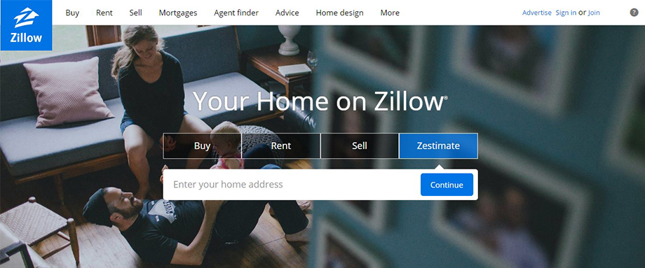
Zillow’s Website Interface
Zillow’s page is probably one of the benchmarks for real estate websites today.
Its features ranges from buying and selling options, rental property listings, mortgaging assistance and agent tracking by location. Other value-adding functionalities includes market trend research and home design suggestions which are also accessible straight from the homepage itself.
It’s quick to load and easy to understand. Interactive boxes separate the primary services. There are also secondary links for specific locations.
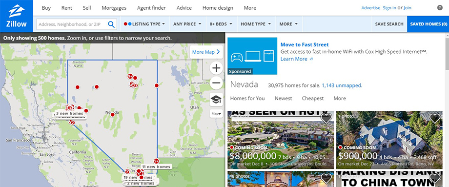
Zillow’s Grid Property Page
From the get-go, Zillow’s grid property search page already offers the prospective home buyer several filtering options so they can narrow down their home searches easily. Individual property thumbnails provide some of the main details that you would need to see for a home, including prices, beds and baths, square footage and the like.
A few of the properties also provide video walkthroughs right from the thumbnail, if available. Saving a search can easily be done by either clicking on the ‘Save Search’ tab on the top bar or by clicking the heart icon on each individual property thumbnail.
Despite being straightforward, there are a few issues with Zillow’s grid page that may post as an inconvenience to users.
This includes:
A few of the Call-to-Action buttons do not pass the WILto (Would I Like to…?) test.
Property prices are mixed up.
Zillow’s grid page is inundated with too much data
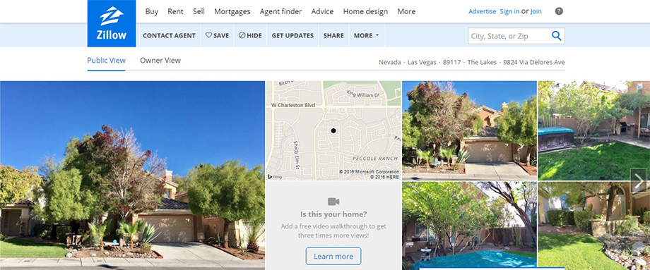
Zillow’s Individual Property Page
You might not be a fan of Zillow’s all-in-one grid view page, but you might find the individual property pages to be more to your liking.
Each of the listed properties in Zillow provide a sort-of mosaic at the top of the page, complete with primary photos, a map locator, and if available, a walkthrough video that property sellers can share. Key property features apart from the standard bed and bath counts are listed in bullets, saving a viewer valuable time in checking out the home’s offerings.
Other page features include the following:
Similar Homes Suggestions
Pricing and tax histories
Home Expenses
Zillow’s distinct Zestimate Feature
Owner View mode feature that allows property sellers to track how their home is faring against other properties of the same price range and style in the same area.
Zillow’s bulleted features setup is a great time-saver for people who just want to know what each home has to offer. It is straightforward and easy to handle, even for a complete newbie. The ‘Owner View’ tab is a great add-on, providing an easier access to the property owner so that they don’t have to switch to a different page altogether to view how their listing is doing.
All in all, there is a lot more user value for each property page than for the grid view overall, though it all comes down to the kind of information the page viewer needs.
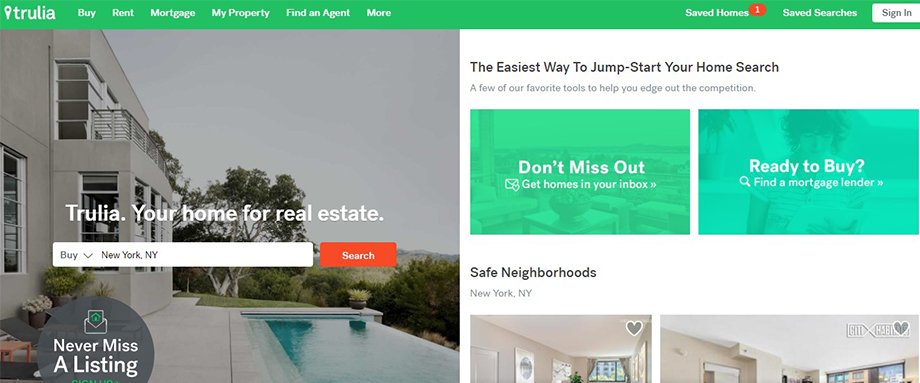
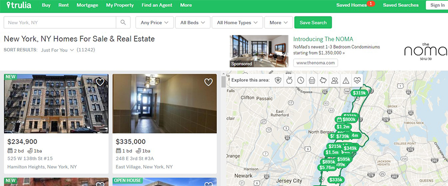
Trulia
From its humble beginnings as an online property listing site for California real estate in 2005, Trulia grew into one of the biggest and most comprehensive property listing sites in the US within more than a year.
It aimed to be the leader in providing complete, up-to-date listings for prospective buyers anywhere in America, until it was eventually acquired by Zillow in 2014. Trulia still retains its unique brand of providing property services to its clients, and it shows on its UI.
Truelia’s Website Interface
Recommended properties are featured on the right side, while the left side is reserved for search boxes and locator maps.
A unique feature that first-time visitors might notice is the ‘Saved Homes’ tab prominently located on the upper right of the page bar. It automatically saves a visitor’s viewed properties for easy review at a later date, provided the visitor has his or her own account. It’s a convenient feature that makes searching for a potential home to buy easier.
Even with the unique features and quick accessibility to recommended real estate right from the get-go, new visitors may be overwhelmed by the layout and appearance of the site itself.
The static setup for the search bar may be confusing at first. The properties are not arranged by price range or number of likes.
In addition, apart from categorizing them by amenities, most of the featured properties are not arranged in a proper order like price range or number of likes. These negatives may put a dampener on prospective Trulia visitors in the future.
Trulia’s Grid Property Page
Trulia’s property grid view can be seen as a mirror of sorts to what Zillow has to offer.
The typical ‘Save Search’ feature is there, as well as the usual filters for narrowing property searches. However, Trulia offers a few distinct differences from Zillow in terms of readability and data previews. There are separate boxes containing basic property information.
Map locator ‘pins’ also provide an estimate price for each property even if you don’t hover your mouse over each indicator. The ‘explore this area: “CtA also provides extra options straight away; you can easily highlight additional information like traffic rate, population and median listing price from the same screen.
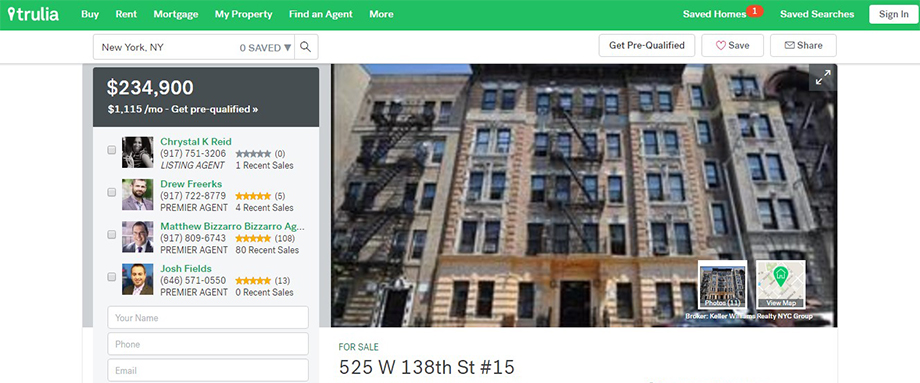
Trulia’s Individual Property Page
One thing that really gets you about Trulia’s individual property page is how they highlight key widgets like nearby schools and crime rate and place them next to the property features. These are vital bits of information which can help you decide whether or not to purchase the property.
If some of the home features are not to your liking, a number of different suggested properties listed under the most commonly searched filters are provided at the bottom of the page.
Trulia’s individual property page is as straightforward as they come.
It’s intuitive for the average home buyer while offering enough extra features for the more savvy property trader to use. It may be a bit minimalist for some, with a few features absent when compared to Zillow (the direct access to Owner View comes to mind). However, the additional property options and the orderly presentation of suggested properties by common filters can more than make up for that deficiency.
Realtor
There is probably no one in the real estate business who hasn’t heard of Realtor. – The official online presence of the National Association of Realtors.
This website is considered as one of the trailblazers in the industry, being the first real estate website to ever go online back in 1995. It holds more than 90% of all Multiple Listing Service (MLS)-listed real estate in the US, a significant share of MLS properties nationwide.
It pioneered such unique innovations as mortgage rate calculators and separating real estate listings into ‘buy’ and ‘sell’ categories.
Realtor’s Website Interface
Realtor’s current website UI, much like Zillow’s, is straight-to-the-point and easy to navigate.
The interface offers a number of different features and options that makes Realtor.com stand out from the crowd. This includes a dedicated link for accredited Realtors, a dynamic mortgage trends graph, comparability tools for renting versus buying a property, and more.
The news, trends and advice section is prominently displayed on the front page as well, providing users with a quick link to the most sought-after property types and features today. Individual property pages avoid the clutter of images and text, and the features and amenities section is easy to read. Realtor’s page is definitely one of the finer examples of a user-friendly UI that does not mince words for its clients.
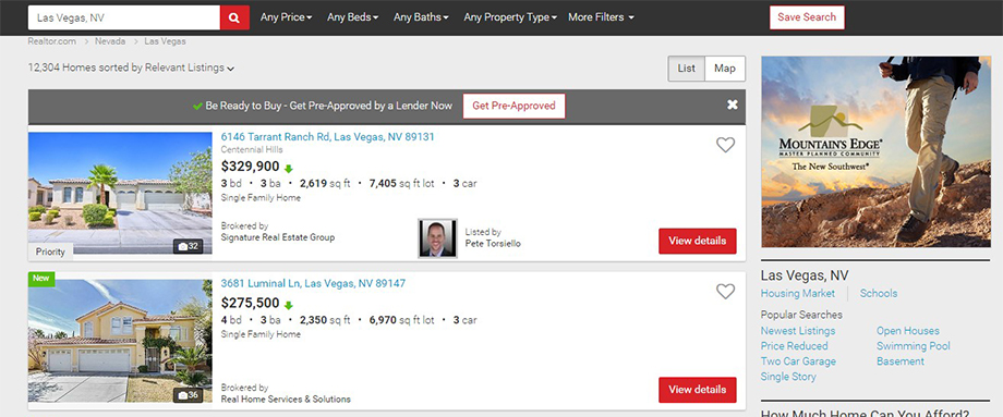
Realtor’s Grid Property Page
The general property view page can be more aptly called a property list page because of how each home listing is presented. It may not be as feature-packed as Zillow or Trulia with their fancy map locator window, but it does have the advantage of loading faster than either of the previous pages.
Basic property information are written plainly and easy to read without muddling over the preview pictures, which is another plus. To make up for the lack of an interactive map, you can check out the ‘Nearby communities’ tab to see the closest neighborhoods that you can switch to.
Popular searches also have their own section on the sidebar. This is a good property overview page for people who are not a fan of excessive interactive features for a page.
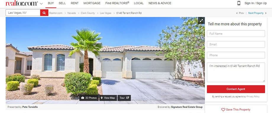
Realtor’s Individual Property Page
Realtor’s individual listing page is unique for having a tie-in service with Yelp. The business listing website provides Realtor users with comprehensive information concerning businesses and establishments that are located close to the currently viewed property. School information is provided with an accompanying rating system.
Despite the ease with which this page can be used, Realtor may need to work on their overviews for the property. So far most of the individual property pages have jumbled home overviews, and the details can be hard to read. This can waste valuable time and effort, especially if you’re in a hurry to list up potential homes to buy. Keep that in mind if you’re planning to use Realtor in the future.
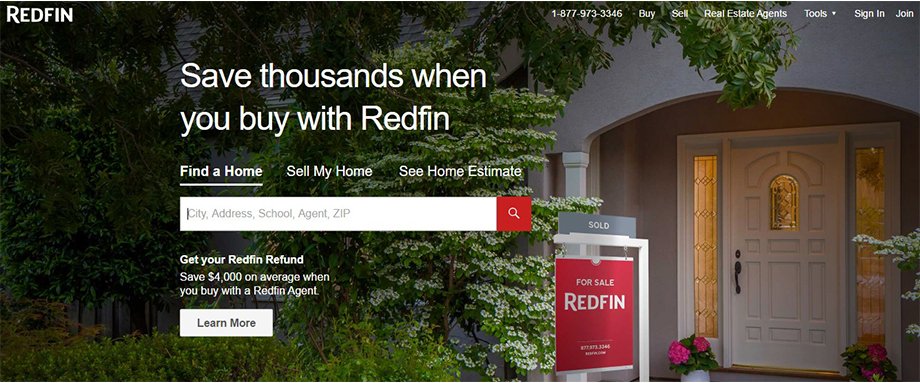
Redfin
Redfin may not be as big as either Realtor or Zillow in terms of areas served, but it is still considered one of the finest online listing sites today.
It is notable for its early adoption of map-based property search systems ahead of the introduction of iconic services like Google Maps or Bing Maps. This innovation made waves in the online real estate market, starting the trend of mapped property searches across the board. It continues to innovate in the industry, a feat that has been recognized by Inman News and Business Insider.
Redfin’s Website Interface
Speaking of innovations, Redfin continues to seek ways to make user experience for their websites both more convenient and more pleasant.
An interactive ‘refund calculator’ lets users estimate how much money they can save when they buy or sale with a Redfin agent. The various real estate tools that a prospective client may need are also listed under a single heading so they don’t get lost trying to find each one.
The community property search page, however, is its main selling point. The interactive map is easy to handle thanks to the zoom feature. Meanwhile, homes are arranged in ascending or descending order depending on which feature the user highlighted at the time.
Being able to switch between photo and table mode can also make it easier for users to get a good preview of the home they want to check out. Redfin’s map search page might be too cluttered for certain visitors.
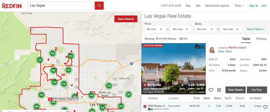
Redfin’s Grid Property Page
Redfin follows the tried-and-tested map-and-list page for its community overview page. It provides an overview of how many properties are listed with Redfin on each map indicator. This provides a peek at how many homes you can choose from in each selected community or region. The user can choose to click any of the highlighted locations to jump immediately to the community.
One thing that sets the Redfin community page from others is the way the properties are presented. Instead of thumbnails arranged in grids, homes are presented in a list. The home is highlighted on top showing all its preview details.
Homes are arranged location-wise by default, so it won’t be difficult to scan through them even for a new user. This already makes Redfin’s community page much more intuitive than either Zillow or Trulia.
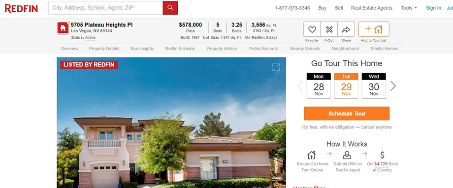
Redfin’s Individual Property Page
Let’s get one thing straight. Redfin’s property features tab for its individual listing page is a wall of bullet-point text. It is not exactly one thing worth reading for someone in a hurry; the general overview provided under the preview pictures is usually more than enough for a quick browse. It does, however, give detailed insights for the extra features on offer, although reading them all can take time.
The asking price, save property and share buttons are there. Plus a ‘Cross Out’ feature if you wish to filter the home away from your next searches.
Redfin’s property pages may need some work with regards to their detailed features tab. The large number of bulleted tabs may not be to the liking of most visitors. Nonetheless, as far as site features and options are concerned, the individual listing page is fairly easy to use.
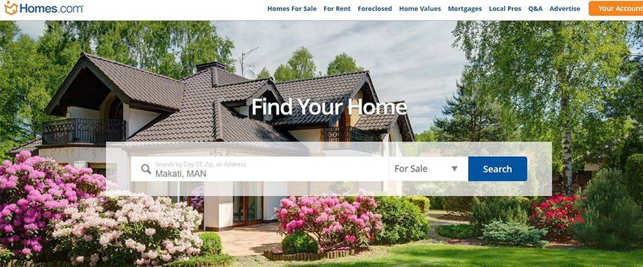
Homes.com
Homes.com may not be as big as the previous websites, but it is still one of the top 10 real estate sites visited across the US, a feat that it has maintained for quite a while now.
Besides covering the basics, Homes.com provides real estate brand advertising, listing syndication and lead generation services. The company is considerably integrated into almost every aspect of real estate that one can think of.
Homes.com’s Website Interface
Though it has consistent performance, Homes.com isn’t exactly in top form when it comes to UI values.
Here’s why:
There are too much blog post on the homepage
The community search pages are the only ones that have property recommendations
Visitors have to login to view the properties
Blogs may not be on a user’s top agenda unless they’re looking for real estate news and marketing trends
The good part is that individual property pages are concise. It offers easy-to-use financing calculators as well as home buying resources that visitors will find useful.
Home’s.com’s Grid Property Page
Homes.com is another site that provides a list view for its offered properties instead of adding up extra features. The highlighted filter options helps for quick property scanning.
Listed alongside the general property details are Call-to-Action buttons such as ‘Save Property’ and ‘Request Info’ options. This makes it easier to keep tabs on specific homes.
The general listings page for this site is fairly simple; perhaps too simple.
There is not much interactivity for it, apart from the filters and CtA buttons provided. The details are straightforward, but there may not be enough information for a first-time viewer to make use of.
Homes.com’s Individual Property Page
This lack of information continues into the individual listing pages.
Though a lot of interactive features are readily available; including maps, virtual tours and mortgaging calculators, it still lacks a concise general overview.
Some properties have details located in an exterior website. This can add to the viewing time and can degrade the overall user experience. Homes.com still have aspects to improve on.
These five websites only provide a snapshot of how the top real estate firms conduct their business online. The key points of an excellent user interface design includes:
ease of use;
conciseness;
interactivity; and
an excellent layout with focus on the proper order of features and products
Keep these points in mind when creating your own real estate website. It wont take long until you attract potential clients without much hassle.
The world is bursting with voices. Every person has it.
I have it.
You have it.
Brands have it.
Your own business or company has it.
Our unique voice is what separates us from the rest of the world, but it’s also what unites us with them. When you’re a creative, the search for your voice—or your brand’s voice—never truly ends. But it’s not finding it that’s hard (though, in its own right, it really is)… it’s not having it heard that gives you bites of anxiety every now and then.
Go back to the very first sentence: truly, the world is filled to the brim with innumerable voices. Some rise up, some drown, some become too obnoxiously loud, some mute themselves to oblivion and some wait for their time to shine naturally. But the content producer’s worst nightmare–aside from the dreaded creative block–is to be unnoticed.
It’s putting your work out there but never having any eyes to read or watch them. It is days upon days of effort just to produce quality content that never gets acknowledged anyway. It’s time you can no longer get back and still have no one learn from whatever you have just painstakingly made.
As content creators, we crave for that–our big break or our overnight success story. We long for an article or a video or a photograph that will define who we are. Just one piece that will shoot us up to the SERPs and we’ll be fine.
As much as I hate admitting it, I’m one of those people. I still am. Hey, one can hope, right?
I am a writer and I’m one of those who would post an article just minutes before sleep. I’ve got my fingers crossed on it, wishing that this is it… This is the blog that will have people talking. Finally, this is my chance to be up there with the people I admire.
Then as I drift off to sleep, I am still haunted by the numbers I wish to reach.
The very first thing I do in the morning? Rush to my phone, open my blog and hope for a miracle.
But the miracle doesn’t happen.
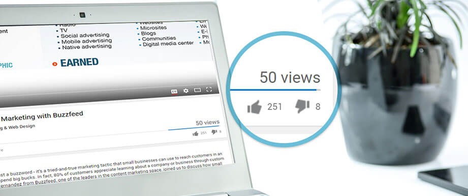
It’s still the same. Nothing extraordinary. Just a like or three, maybe sixteen if I get lucky. But that’s it. No shares. Maybe a comment or two. That’s it.
The Number Game
Have I painted a familiar picture? Or is it really just me?
Maybe it is, maybe it isn’t. But I’m sure we all dream of having numbers greater than fifty or a hundred. Because, let’s face it–6, 10, 25… 1? They really aren’t all that encouraging.
At this point, most content marketers get disheartened by the statistics. They either:
give it up altogether and convince themselves that they don’t need content marketing;
try again with the same or a different strategy; or,
they try an alternative—they hack it prematurely (I’ll discuss this further later).
We turn to these because we see low numbers as a sign of failure. But here’s the truth powerfully articulated by Gary Vaynerchuk:
One is greater than zero. Turns out, this truth doesn’t only apply to mathematics; it applies to us content creators as well.
“Because I’m all about depth over width. I want to go deeper with my community. I want to give back to people who support me.”
Just because someone has a thousand readers or viewers doesn’t mean each and every one of those numbers have read or watched the entirety of the article or the video.
Keep this in mind: Never underestimate the value of 1. 1 counts. 1 is still one person. One person who took the time to digest what you’ve made. One person who you’ve successfully sent your message to. Because, in the end, isn’t that what we truly want? Not to be “liked” per se, but to be able to communicate deeper with our current and potential customers?
After all, “You might make a video with 89 views. But one of those viewers could be a producer at CNN. Undervaluing just that one view is a huge mistake.”
The Process Blurred Out by the Outcome
Another point Vaynerchuk hits homerun with is this:
“To me, doing these interviews or guest posts is about the process of the work. Too many people are impatient and not willing to do that work.”
In a fast-paced world that’s hungry for instant gratification, we value the outcome more than the process itself. All because it’s what we can see or touch that we consider valuable.
Zuckerberg. Gates. Musk. Jobs. We are blinded by the sparkle that comes with their names or the nonstop development of their products and services. We regard them as how we regard comic book superheroes—all powerful and otherworldly.
But they’re human and I’m pretty sure they were once in the very situation you are in right now.
The climb, the grind, the process doesn’t stop. Not even for these people.
Remember what Richard Branson said?
“There are no quick wins in business–it takes years to become an overnight success.”
Years.
While it is possible to create mind-blowing content within a few days, the reality of content marketing is that it takes months—or even years—to get to where you want to be.
The Lengthy Journey
The whole content marketing process is a journey. It’s you, the content creator, in front of a long and winding road. As cliché as that metaphor might sound, it’s an accurate depiction of what we have to face every waking moment of our lives.
Now what most people see is only the actual piece that we produce. What is hidden from them is the amount of effort and time we’ve poured into every single part of the content we create.
Think of the extensive research materials writers have to sift through just to make one article comprehensive and thought-provoking. The hours upon hours of shooting and editing one video just to produce something worthwhile. All the eyestrains of making one infographic come to life.
That’s just one. Imagine having to do a bunch of that every single day.
Your clients and prospective customers do not see this. They don’t see the map you’ve prepared for yourself and for them.
They’re blind to the road in front of you that’s going every which way, expanding and expanding as you keep creating and creating. It opens up possibilities of what you could do better. Maybe even what you could produce in the future.
They don’t see the step of bravery you and your company has to take every time you produce something, just this one thing. The risks, the fear, the confusion on what to do and what not to do… This is the reality. This is your journey.
And in journeys such as this, you need limitless supplies of what will keep you going. In the world of content marketing, you need these three:
Consistency
Patience
Perseverance
Believe me. Though there are only three of them, it’s way harder than it looks.
The Case for Consistency
There’s a quote floating around the internet which says “Lack of consistency can bring on a lack of interest.”
Isn’t it true though? These are what inconsistency can bring to your business:
It makes you forgettable
The moment you stop posting is the moment people will start overlooking you. It’s like dealing with friends. There’s a huge chance that you’d forget about them once you don’t talk with them.
The thing about consistency in content marketing is that it reminds people that you exist. Your brand’s website or your blog is like a living, breathing being. Once you stop producing content, you start killing what you already have. And once it’s dead, people will have a hard time trying to remember you.
It annoys people
Think of it this way: there’s a chef who makes the best soup in town. People just can’t get enough of it, especially his customers. Then one day, the quality of his soup starts to dwindle down. And then bam! Out of nowhere, he just vanishes.
Wouldn’t that annoy you the slightest bit? The same goes with content marketing; inconsistency—whether or not you’re focused on quality or quantity—disappoints.
It makes you look unprofessional
A blog that hasn’t had a post in months or a social media profile without any update whatsoever makes you look unreliable. Your potential clients will either think that you don’t care or that you’re too lazy or that your company no longer exists. Once they see this, they’re out of your doorstep before you could even convince them to stay.
It makes you an easy prey
Each and every single one of your competitors are vying for that top spot on the SERPs. Without a consistent content marketing strategy, other businesses will overtake you. Without it, your could-have-been-potential customers will just find another company to do business with.
Uploading content on a regular basis reminds people of your business. It makes them feel as if they can count you… because they can. You just have to show them.
A quote from Joe Pulizzi summarizes it perfectly, “Content marketing is a promise to your customers. If you stop or are too irregular with your content, are you breaking your promise?”
The Case for Patience
Echoing Richard Branson’s wise words, overnight success is a myth. Other than constantly producing content, there’s another thing you have to keep by your side as a content creator: patience.
This is where hacking doesn’t come in. You read that right–doesn’t.
It’s tempting. It really is. It’s the easy way out. Pop an advert here and there and you’re sure to get that traffic you long for… right?
But can you guarantee success on something so instant? Can you really rely on it?
Here’s another truth from the sales lion Marcus Sheridan:
“Creating a culture of content marketing success isn’t easy. It takes time, tools, resources, and major dedication.”
Content marketing is a long term investment. You don’t get results in a snap. So, as much as possible, stop expecting it to do so.
According to Sheridan, it takes at least three to six months till you finally get the leads you’ve been longing for. Then about four to twelve months before you get the sales and revenue you deserve. Of course, this wouldn’t be possible if you are not willing to:
Produce fresh and excellent content for your on-page blog and off-page accounts.
Promptly and regularly respond to your prospects or customers questions.
Get the full participation of the entire company. In content marketing—as in life—no man is an island. You cannot go through with this process alone.
I urge you to read and bookmark this article by Marcus Sheridan as it will accurately show you the stages you will undergo if you choose to pursue content marketing success.
As Yoda would say, “Patience you must have, my young Padawan.” Give it time. The trek upwards is slow and challenging but every step guarantees you the glorious view at the top.
The Case for Perseverance
Perseverance is going beyond consistency and patience. Still remember what Vaynerchuk said?
“When you’re still making the climb, when you haven’t made your name known yet, you need to put in that work.”
Creating a name for yourself isn’t as easy as what self-help articles with clickbait titles make it out to be. There’s no easy way to do it and I promise you, there will be times when the climb will take so much out of you.
This journey will get to a point when it will wear you and your whole team down. You will keep wondering what in the world you’re doing wrong. And there will come a time when you will want to just throw in the towel. You will want to give up.
Just like most content marketers.
The truth is, you’re not alone in this one. According to a study by the LinkedIn Technology Marketing Community, the top 5 content marketing challenges are as follows:
Lack of Time/Bandwidth to Create Content (51%)
Producing Enough Content Variety/Volume (50%)
Producing Truly Engaging Content (42%)
Measuring Content Effectiveness (38%)
Developing Consistent Content Strategy (34%)
Content marketing isn’t easy. Mistakes will be made and the numbers on your analytics will keep fluctuating. Those years ahead of you know this to be true. Not all the content they’ve produced have been seen by a million eyes, but they keep doing it anyway. Why? Because it’s all worth it in the end.
After all, high quality content produces more than just links—it develops your brand image and, more importantly, it builds a relationship between you and your customers. What you’ve created will prove useful to you and your business for years to come. Articles, videos, even infographics and other images can be made evergreen.
You can repurpose them year after year after year. What you’ve produced can be as everlasting as you wish them to be.
With those long-term benefits in mind, I ask you this: what have you got to lose?
The Case for Hacking
Content marketing is a lengthy journey that keeps going and going. And you have to go along with it.
There comes a time when you can hack it. But if you don’t have enough reputation yet, you’ll only be wasting your money. See, no matter how many times you put an advertisement on the SERPs, on Facebook or Twitter or any other social media site, people will just scroll past you because they don’t even know who you are.
When phenomenal growth happens during your content marketing journey (and it will), that’s the only time when you can play around with the idea of hacking it.
This technique is only taking it to the next level. When you’ve already made a name for yourself, people will gladly click on whatever advertisement you’ve created.
A word of warning though: you can’t keep relying on hacks. Ultimately, it’s your content—and your consistency, patience and perseverance—that will define whether or not a person will do business with you.
Your Journey Doesn’t End
Content marketing doesn’t end with attaining the goals you’ve set out from the moment you’ve created your strategy. There are a million things you will learn along the way.
You might discover that the things that worked out for other people, won’t necessarily work for you. You might find that consistency, patience and perseverance aren’t the only “virtues” you will need by your side. Your brand might even develop a voice much stronger than what it had before.
It doesn’t end, but here’s a tip: just keep going. It’s a journey after all.
Much like content marketing, there are myths spread all over the internet saying email marketing is dead.
It isn’t.
In fact, to this day, it is dubbed the King of ROI in the marketing industry. What with a whopping “3800% ROI and $38 for every $1 spent.”
To further prove email’s rule over every other medium, a study by Marketing Sherpa showed that email is the preferred business communication channel across all age groups (18-65+).
To put all of these numbers in perspective, let me ask you, how many times a day do you check your email account or accounts? According to a report by The Relevancy Group, 66% of online consumers go through their emails multiple times a day. 13% even said they actually check theirs hourly or even more frequently than that.
Quite large numbers, aren’t they? That’s the power of email marketing for you.
What is Email Marketing?
Email marketing is delivering your marketing message to one medium that has been present since the early days of the internet – electronic mail.
Your business can use email marketing in a variety of ways, some of which include:
brand and customer loyalty building
customer engagement
advertising of new products and services
delivery of promotional offers
And more. It’s basically the most efficient way to stay connected with your clients.
Don’t be deceived though. Email marketing takes just as much effort as marketing on social media, search engines and other mediums.
We’re talking about building an email list to reach both your established and potential customers. Then there’s creating the content of your email and sending them to specific members on your email list. Because after all, to quote Mohit Sani, “When your audience signs up to receive your emails, they expect to be rewarded for it. They expect you to add value to their inbox, not to clutter it.”
Why Email Marketing?
There are a number of reasons why email outperforms other mediums known to internet marketing. Here are some of them:
All in the Statistics
Aside from being the king of ROI, email drives the most traffic compared to other mediums. Emails receive an average click through rate of 5.2% while Facebook and Twitter – two of the most popular social media platforms – only get 1.49% and 1.69% respectively.
Email is pretty much the king of everything because it does wonders for conversions as well. Compared to social media (with only .59%) and search engines (2.49%), email marketing garners 4.24% of purchasing visitors.
It Delivers
Nothing is more annoying than your message being ignored. And in social media, you have to face that reality. For your potential clients, it’s so easy to scroll past your post or worse, block you out of their newsfeeds forever. According to Forrester, 90% of emails get delivered to the intended receiver. Compare this to a measly 2% of your Facebook followers.
With email, your message is delivered straight to their inboxes – which means, it has a higher chance of being read.
It’s Timeless
Some platforms die horrible deaths. Remember MySpace, Xanga and Friendster? Their times have passed. But email, on the other hand, has been stable ever since its inception. It’s only been evolving since then and it doesn’t seem to show any signs of stopping.
How do I start Email Marketing?
Now it might seem like email marketing is all glitz and glamour. Here’s the reality: it isn’t a walk in the park. Not everyone experiences the transformative ROI that comes with email marketing. Why? Because they probably didn’t think about it as much as they should have.
Before hitting send, ask yourself these questions first:
Have I already asked permission from this client?
Have I checked my email list for any inactive address?
Is my subject line interesting or does it sound too spammy?
Have I added in my call-to-action?
Did I personalize the content of my email?
The last one might be the most important of all. Remember: your established and prospective clients’ value their email accounts a lot. It’s their personal space in the vastness of the very public internet. Everything is there. Important messages, documents, even their to-do lists. And since everything is there, you – as the email marketer – have to realize that you’re in their turf.
Here’s a suggestion from Ryan Stewart, “Birthdays, anniversaries and other data points are easy ways to build stronger relationships.” Who wouldn’t want to be greeted on their birthday? Add in a little freebie as a gift and you’re sure to capture the heart (and loyalty) of that particular client.
A valuable email goes a long, long way. Creating an email marketing strategy for your digital marketing in the Philippines will require a lot of your time and attention. Much like all other marketing strategies, email marketing involves trial and error as it is the best way to learn what works and what doesn’t. And, of course, don’t forget to track all your results!