The real estate business is a people-to-people industry; clients’ needs are always the top priority.
Clients expect the highest and most comprehensive level of service from agents. The slightest miss can spell out trouble for the company’s reputation in the industry.
This high-end service isn’t limited to physical transactions alone. In today’s internet-connected world, more people scout online to look for real estate agencies to work with.
The way a real estate website works has become a primary metric if it’s worth working with or not.
User Interface Lessons from the Most Popular Real Estate Websites
Real estate businesses are starting to realize the importance of a user-friendly website and are now more open to using digital marketing solutions in the Philippines and the world. Requiring them to regularly update their user interfaces to meet ever-changing demands and trends.
To illustrate this concept, see how user interface impacts the user experience of these most-visited real estate websites.
Zillow
There’s no need for introductions when it comes to Zillow.
Everyone knows that it’s one of the real estate buying and selling services leaders. Homeowners, prospective home buyers and real estate agents all benefit from the multitude of services that Zillow provides.
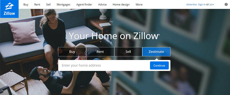
Zillow’s Website Interface
Zillow’s page is probably one of the benchmarks for real estate websites today.
Its features ranges from buying and selling options, rental property listings, mortgaging assistance and agent tracking by location. Other value-adding functionalities includes market trend research and home design suggestions which are also accessible straight from the homepage itself.
It’s quick to load and easy to understand. Interactive boxes separate the primary services. There are also secondary links for specific locations.
Zillow’s Grid Property Page
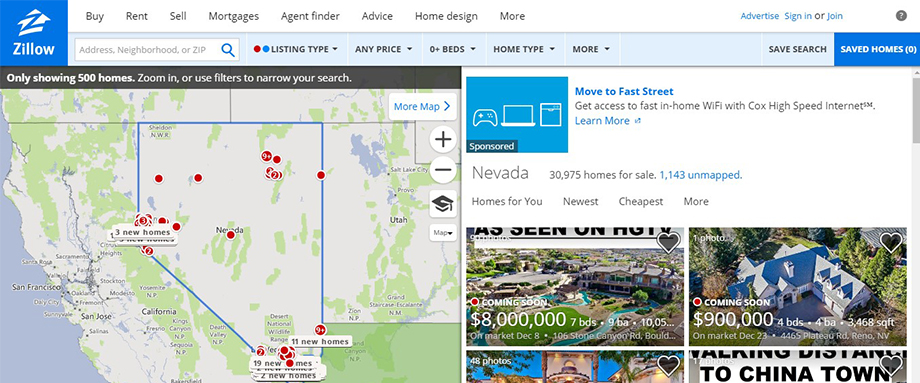
From the get-go, Zillow’s grid property search page already offers the prospective home buyer several filtering options so they can narrow down their home searches easily. Individual property thumbnails provide some of the main details that you would need to see for a home, including prices, beds and baths, square footage and the like.
A few of the properties also provide video walkthroughs right from the thumbnail, if available. Saving a search can easily be done by either clicking on the ‘Save Search’ tab on the top bar or by clicking the heart icon on each individual property thumbnail.
Despite being straightforward, there are a few issues with Zillow’s grid page that may post as an inconvenience to users.
This includes:
- A few of the Call-to-Action buttons do not pass the WILto (Would I Like to…?) test.
- Property prices are mixed up.
- Zillow’s grid page is inundated with too much data
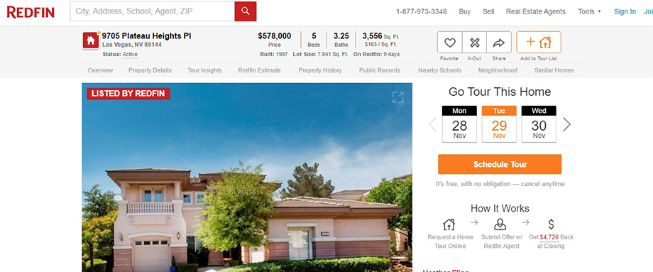
Zillow’s Individual Property Page
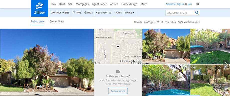
You might not be a fan of Zillow’s all-in-one grid view page, but you might find the individual property pages to be more to your liking.
Each of the listed properties in Zillow provide a sort-of mosaic at the top of the page, complete with primary photos, a map locator, and if available, a walkthrough video that property sellers can share. Key property features apart from the standard bed and bath counts are listed in bullets, saving a viewer valuable time in checking out the home’s offerings.
Other page features include the following:
- Similar Homes Suggestions
- Pricing and tax histories
- Home Expenses
- Zillow’s distinct Zestimate Feature
- Owner View mode feature that allows property sellers to track how their home is faring against other properties of the same price range and style in the same area.
Zillow’s bulleted features setup is a great time-saver for people who just want to know what each home has to offer. It is straightforward and easy to handle, even for a complete newbie. The ‘Owner View’ tab is a great add-on, providing an easier access to the property owner so that they don’t have to switch to a different page altogether to view how their listing is doing.
All in all, there is a lot more user value for each property page than for the grid view overall, though it all comes down to the kind of information the page viewer needs.
Trulia

From its humble beginnings as an online property listing site for California real estate in 2005, Trulia grew into one of the biggest and most comprehensive property listing sites in the US within more than a year.
It aimed to be the leader in providing complete, up-to-date listings for prospective buyers anywhere in America, until it was eventually acquired by Zillow in 2014. Trulia still retains its unique brand of providing property services to its clients, and it shows on its UI.
Truelia’s Website Interface
Recommended properties are featured on the right side, while the left side is reserved for search boxes and locator maps.
A unique feature that first-time visitors might notice is the ‘Saved Homes’ tab prominently located on the upper right of the page bar. It automatically saves a visitor’s viewed properties for easy review at a later date, provided the visitor has his or her own account. It’s a convenient feature that makes searching for a potential home to buy easier.
Even with the unique features and quick accessibility to recommended real estate right from the get-go, new visitors may be overwhelmed by the layout and appearance of the site itself.
The static setup for the search bar may be confusing at first. The properties are not arranged by price range or number of likes.
In addition, apart from categorizing them by amenities, most of the featured properties are not arranged in a proper order like price range or number of likes. These negatives may put a dampener on prospective Trulia visitors in the future.
Trulia’s Grid Property Page
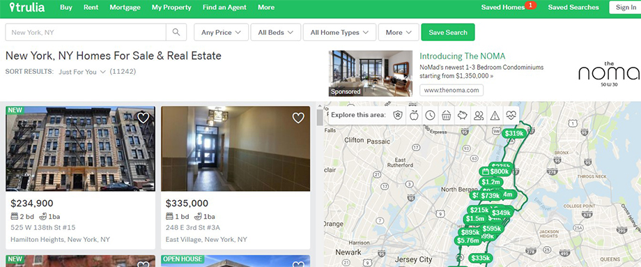
Trulia’s property grid view can be seen as a mirror of sorts to what Zillow has to offer.
The typical ‘Save Search’ feature is there, as well as the usual filters for narrowing property searches. However, Trulia offers a few distinct differences from Zillow in terms of readability and data previews. There are separate boxes containing basic property information.
Map locator ‘pins’ also provide an estimate price for each property even if you don’t hover your mouse over each indicator. The ‘explore this area: “CtA also provides extra options straight away; you can easily highlight additional information like traffic rate, population and median listing price from the same screen.
Trulia’s Individual Property Page
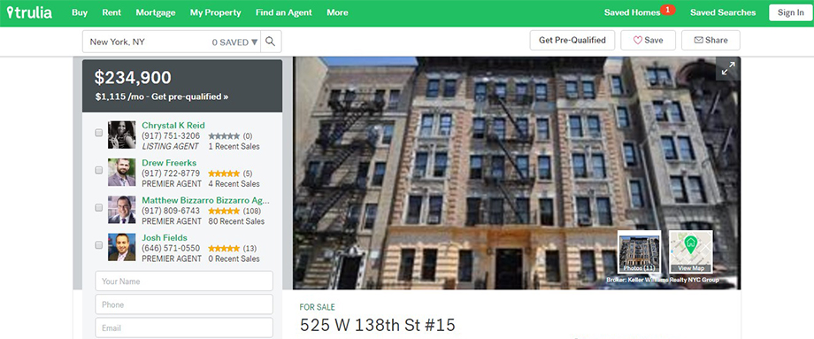
One thing that really gets you about Trulia’s individual property page is how they highlight key widgets like nearby schools and crime rate and place them next to the property features. These are vital bits of information which can help you decide whether or not to purchase the property.
If some of the home features are not to your liking, a number of different suggested properties listed under the most commonly searched filters are provided at the bottom of the page.
Trulia’s individual property page is as straightforward as they come.
It’s intuitive for the average home buyer while offering enough extra features for the more savvy property trader to use. It may be a bit minimalist for some, with a few features absent when compared to Zillow (the direct access to Owner View comes to mind). However, the additional property options and the orderly presentation of suggested properties by common filters can more than make up for that deficiency.
Realtor

There is probably no one in the real estate business who hasn’t heard of Realtor. – The official online presence of the National Association of Realtors.
This website is considered as one of the trailblazers in the industry, being the first real estate website to ever go online back in 1995. It holds more than 90% of all Multiple Listing Service (MLS)-listed real estate in the US, a significant share of MLS properties nationwide.
It pioneered such unique innovations as mortgage rate calculators and separating real estate listings into ‘buy’ and ‘sell’ categories.
Realtor’s Website Interface
Realtor’s current website UI, much like Zillow’s, is straight-to-the-point and easy to navigate.
The interface offers a number of different features and options that makes Realtor.com stand out from the crowd. This includes a dedicated link for accredited Realtors, a dynamic mortgage trends graph, comparability tools for renting versus buying a property, and more.
The news, trends and advice section is prominently displayed on the front page as well, providing users with a quick link to the most sought-after property types and features today. Individual property pages avoid the clutter of images and text, and the features and amenities section is easy to read. Realtor’s page is definitely one of the finer examples of a user-friendly UI that does not mince words for its clients.
Realtor’s Grid Property Page
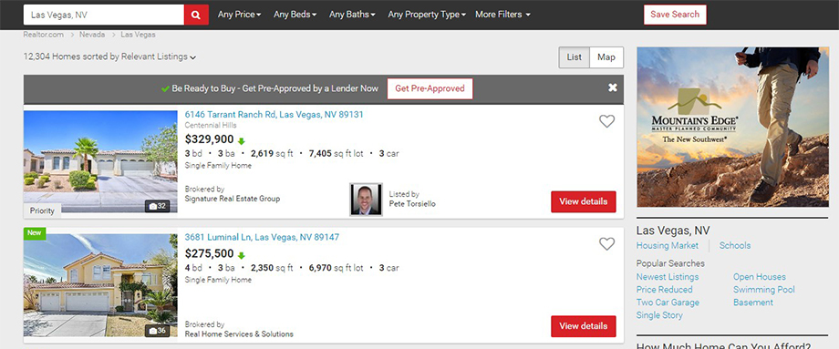
The general property view page can be more aptly called a property list page because of how each home listing is presented. It may not be as feature-packed as Zillow or Trulia with their fancy map locator window, but it does have the advantage of loading faster than either of the previous pages.
Basic property information are written plainly and easy to read without muddling over the preview pictures, which is another plus. To make up for the lack of an interactive map, you can check out the ‘Nearby communities’ tab to see the closest neighborhoods that you can switch to.
Popular searches also have their own section on the sidebar. This is a good property overview page for people who are not a fan of excessive interactive features for a page.
Realtor’s Individual Property Page

Realtor’s individual listing page is unique for having a tie-in service with Yelp. The business listing website provides Realtor users with comprehensive information concerning businesses and establishments that are located close to the currently viewed property. School information is provided with an accompanying rating system.
Despite the ease with which this page can be used, Realtor may need to work on their overviews for the property. So far most of the individual property pages have jumbled home overviews, and the details can be hard to read. This can waste valuable time and effort, especially if you’re in a hurry to list up potential homes to buy. Keep that in mind if you’re planning to use Realtor in the future.
Redfin
Redfin may not be as big as either Realtor or Zillow in terms of areas served, but it is still considered one of the finest online listing sites today.
It is notable for its early adoption of map-based property search systems ahead of the introduction of iconic services like Google Maps or Bing Maps. This innovation made waves in the online real estate market, starting the trend of mapped property searches across the board. It continues to innovate in the industry, a feat that has been recognized by Inman News and Business Insider.
Redfin’s Website Interface
Speaking of innovations, Redfin continues to seek ways to make user experience for their websites both more convenient and more pleasant.
An interactive ‘refund calculator’ lets users estimate how much money they can save when they buy or sale with a Redfin agent. The various real estate tools that a prospective client may need are also listed under a single heading so they don’t get lost trying to find each one.
The community property search page, however, is its main selling point. The interactive map is easy to handle thanks to the zoom feature. Meanwhile, homes are arranged in ascending or descending order depending on which feature the user highlighted at the time.
Being able to switch between photo and table mode can also make it easier for users to get a good preview of the home they want to check out. Redfin’s map search page might be too cluttered for certain visitors.
Redfin’s Grid Property Page
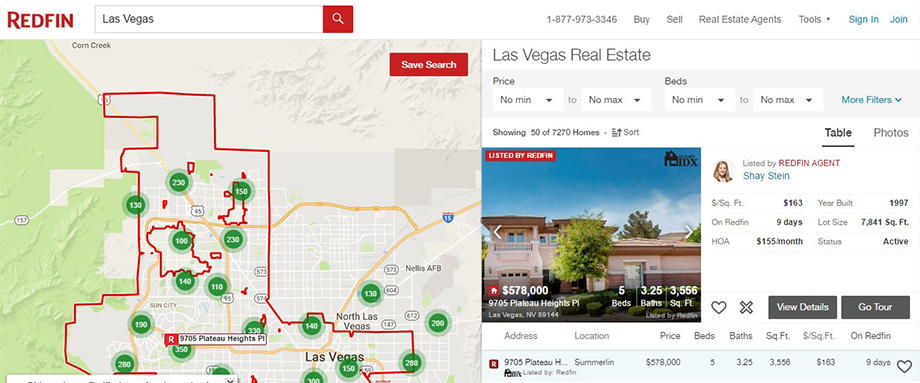
Redfin follows the tried-and-tested map-and-list page for its community overview page. It provides an overview of how many properties are listed with Redfin on each map indicator. This provides a peek at how many homes you can choose from in each selected community or region. The user can choose to click any of the highlighted locations to jump immediately to the community.
One thing that sets the Redfin community page from others is the way the properties are presented. Instead of thumbnails arranged in grids, homes are presented in a list. The home is highlighted on top showing all its preview details.
Homes are arranged location-wise by default, so it won’t be difficult to scan through them even for a new user. This already makes Redfin’s community page much more intuitive than either Zillow or Trulia.
Redfin’s Individual Property Page
Let’s get one thing straight. Redfin’s property features tab for its individual listing page is a wall of bullet-point text. It is not exactly one thing worth reading for someone in a hurry; the general overview provided under the preview pictures is usually more than enough for a quick browse. It does, however, give detailed insights for the extra features on offer, although reading them all can take time.
The asking price, save property and share buttons are there. Plus a ‘Cross Out’ feature if you wish to filter the home away from your next searches.
Redfin’s property pages may need some work with regards to their detailed features tab. The large number of bulleted tabs may not be to the liking of most visitors. Nonetheless, as far as site features and options are concerned, the individual listing page is fairly easy to use.
Homes.com

Homes.com may not be as big as the previous websites, but it is still one of the top 10 real estate sites visited across the US, a feat that it has maintained for quite a while now.
Besides covering the basics, Homes.com provides real estate brand advertising, listing syndication and lead generation services. The company is considerably integrated into almost every aspect of real estate that one can think of.
Homes.com’s Website Interface
Though it has consistent performance, Homes.com isn’t exactly in top form when it comes to UI values.
Here’s why:
- There are too much blog post on the homepage
- The community search pages are the only ones that have property recommendations
- Visitors have to login to view the properties
- Blogs may not be on a user’s top agenda unless they’re looking for real estate news and marketing trends
The good part is that individual property pages are concise. It offers easy-to-use financing calculators as well as home buying resources that visitors will find useful.
Home’s.com’s Grid Property Page

Homes.com is another site that provides a list view for its offered properties instead of adding up extra features. The highlighted filter options helps for quick property scanning.
Listed alongside the general property details are Call-to-Action buttons such as ‘Save Property’ and ‘Request Info’ options. This makes it easier to keep tabs on specific homes.
The general listings page for this site is fairly simple; perhaps too simple.
There is not much interactivity for it, apart from the filters and CtA buttons provided. The details are straightforward, but there may not be enough information for a first-time viewer to make use of.
Homes.com’s Individual Property Page
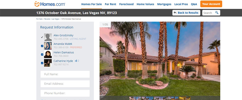
This lack of information continues into the individual listing pages.
Though a lot of interactive features are readily available; including maps, virtual tours and mortgaging calculators, it still lacks a concise general overview.
Some properties have details located in an exterior website. This can add to the viewing time and can degrade the overall user experience. Homes.com still have aspects to improve on.
These five websites only provide a snapshot of how the top real estate firms conduct their business online. The key points of an excellent user interface design includes:
- ease of use;
- conciseness;
- interactivity; and
- an excellent layout with focus on the proper order of features and products
Keep these points in mind when creating your own real estate website. It wont take long until you attract potential clients without much hassle.