To some entrepreneurs, online marketing may come across as something that is easy to do – just hire a web developer that can come up with an awesome website, then produce a bunch of content that will explain the nature of your business; afterwards, find yourself a reliable SEO professional who can help pull up your website’s search ranking, and voilà — now your business is aboard the train of online marketing.
Easy as 1, 2, 3, right? But not really.
Designing a layout and coding the site already take weeks up to months at a time to accomplish, depending on how simple or advanced the website’s functions are. What follows is a series of intensive internal quality assessment which is done by the developers to ensure a smooth sailing website with zero issues.
Then comes content generation — this includes everything starting from a website’s homepage headline down to its published blogs. And lastly is the icing on the cake: The site’s Search Engine Optimization (SEO) – say hello to keyword research, link building and site auditing.
I bet I’m already boring you with all these jargons, so let’s stop here. One would assume – especially if you’re the type of entrepreneur who focuses more on your business’s face-to-face marketing rather than your online presence – that after all the time and money invested on web development and SEO, you would see a big spike in your conversions.
If you did, then kudos to your web and SEO team! If not, then something is clearly not right.
Landing pages are the site’s “Money pages”
The quality of your landing pages is the biggest factor that can affect your website’s conversion rate. It is through this pages that web visitors are encouraged to take specific actions which can potentially turn into sales. For this to be attained, a landing page needs to have these qualities:
An Effective Headline

A website’s headline is everything. (No, this is not an exaggeration.)
The headline, which is the first element a web user should see when visiting a page, is the key player that determines whether the person will opt to stay and engage with your site or not.
Your headline should be clear and self-explanatory so that when people visit your page and read your headline, it wouldn’t be difficult for them to understand what you offer. Make it simple and straight to the point. Play safe and don’t attempt to come up with a “clever” headline that may end up confusing potential customers.
Managing to gain web visitors in your page is already an achievement. It doesn’t matter whether they discovered your site through organic search or by referral. The point is you’ve already done something to lead your customers to your homepage. So don’t make the mistake of putting up a lousy headline that will drive them away.
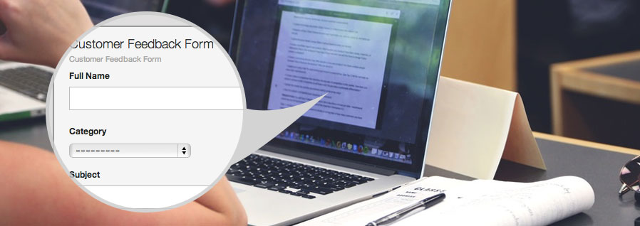
A Clear Call to Action
A call to action may vary depending on what you want your web visitors to do when they’re redirected to a landing page in your site.
Whether your aim is for your web visitors to subscribe to your newsletters, purchase a product or avail a service, make sure that they focus on the action you want them to do. Avoid distracting them with lots of other requests.
Displaying ads on important landing pages – most especially your homepage – is a big NO. We all know how short people’s attention span are nowadays, so stir away from putting unnecessary links to avoid distracting your potential customers.
Helpful Tip: Experiment with the colors, sizes and placements of your call-to-action buttons. Avoid using the same color as your layout background. Also, try not to come off as too demanding when making a call-to-action copy. It’s more advisable to use subtle words such as “Support our cause” compared to “Donate Now.”
A User-friendly Layout
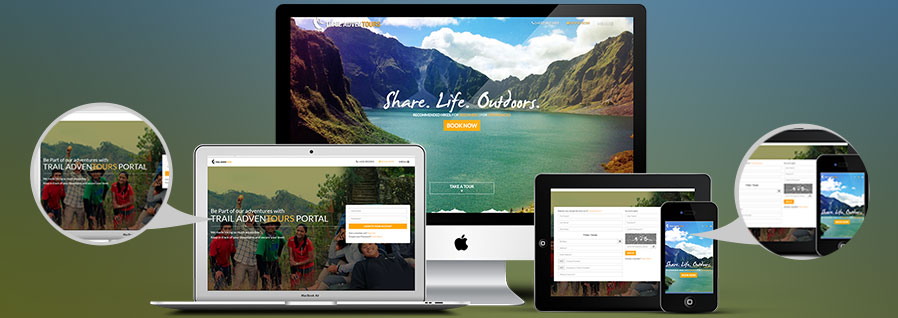
Remember that when designing a website, the layout you see on your big HD monitors may not be the same with how web users view it in their own devices.
One crucial aspect that needs to be considered is a site’s optimization not only on desktops but also in other devices such as smart phones and tablets. Now that the demand for smartphones are on the rise, more people are opting to use their handheld devices in doing online searches and purchases.
Helpful Tip: One best practice you can do to make sure that your landing pages – especially your homepage – are optimized for any type of device is to put the most important elements on your site at the center of the page. Inform your designer to adjust the display and check the layout at different resolutions. In this way, you can be sure that everyone can see the headline and call-to-action buttons without scrolling even if they are using different monitors.
Good Set of Visuals

This applies not only to your homepage but also to all other important landing pages as well.
Keep everything simple.
Aim for a clean design so that web visitors will not trail away from your call-to-action. Use fonts that can be easily read and never underestimate the power of good paragraphing and bulleting. Note that when people browse a website, they don’t actually read the entirety of the content — most just skim through the pages looking for the information they need. Blocks of text will just push potential clients to press the back button.
Yes, graphical content stimulates attention but too much of it can sidetrack your web visitors. Don’t let design be the cause of your problem. Instead of cluttering your landing pages with lots of images and videos, experiment on what works best for your business. Determine where your audience reacts better – Is your conversion rate higher when you showcase images and illustrations or does putting up videos help your page more?
Important note: Let’s say you own a real estate website, and decide to include lots of graphical content in your landing pages. It’s actually not a problem as long as everything you include is relevant to the overall purpose of your page. Optimizing the images you upload in your website is also something that shouldn’t be overlooked. Failing to optimize images can cause your page to load slower, which can negatively affect the user experience of your visitors.
A Substantial Social Proof
People are highly social which is why most of us tend to give high regards to the opinion of others. This goes especially true when it comes to trying new products and services. More often, people rely on the experiences of other consumers to determine whether they’ll try a product/service.
When you finally get the chance to gain loyal customers, don’t forget to ask for their feedback. This is a good way to show how people derived value from what you offer. Aside from testimonials, you can also display a list of your most prominent clients, press mentions and your usage statistics.
Helpful Tip: When displaying the logos of your clients, make sure to keep the design clean and in uniform sizes. If possible, display them in gray scale to minimize the attention they will get from your web visitors. Remember that the goal of putting in social proof is for you to convince people to trust your brand.
The main purpose of your landing page is to prompt web visitors to take a specific action in your site. Seems simple enough but it really is a bit tricky and complicated. This is why testing different versions of landing page layouts is advisable. In this way, you’ll know what works well within your niche and your entire digital marketing strategy in the Philippines.